
こちらは、Qiitaに投稿した記事と同じ記事になります。
はじめに
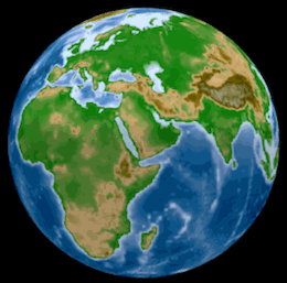
Pythonをはじめ様々な言語に対応し、比較的容易にインタラクティブな図を描画できるPlotlyを利用して、標高データを用いてGoogle Earthのようなグルグル回せる地球儀を作成してみます。
結果はこんな感じ。 https://rkiuchir.github.io/3DSphericalTopo
3つのポイント
- 標高データの取得および読み込み
- 直交座標系で表現される緯度経度情報を球面座標系に変換(Plotly Chart Studio: Heatmap plot on a spherical mapを参考)
- Plotlyで描画
実行環境
- macOS 10.14 Mojave
- Python 3.6 (Anaconda)
- Jupyter notebook
0. Plotlyのインストール
pip install plotlyでインストール可能です。
1-1. 標高データの取得
- 全球的に1分刻みの解像度を持つ標高データ(ETOPO1 Global Relief Model)が、NOAA(アメリカ海洋大気庁: National Oceanic and Atmospheric Administration)におけるこちらのサイトで公開されています。
- 今回は、ETOPO1 Ice Surfaceのgrid-registeredのnetCDF形式ファイル(ETOPO1_Ice_g_gdal.grd)をダウンロードします。
1-2. 標高データの読み込み
まずは、netCDF形式のデータファイルから緯度経度と標高の3つのデータを読み込みます。
- ここで定義しているInputは、指定された領域の緯度 (lat_area)・経度 (lon_area)・解像度(resolution)です。
- Outputは指定した領域でのmesh typeの緯度 (lon)・経度 (lat)・解像度 (topo)になります。
- 解像度の部分は、° (degree)の形式で指定し、最も解像度の高い指定は0.0167°になります。
解像度に関しては、指定された解像度値に合わせてデータをスキップする形で入力しています。
import numpy as np
from netCDF4 import Dataset

def Etopo(lon_area, lat_area, resolution):
    ### Input
    # resolution: resolution of topography for both of longitude and latitude [deg]
    # (Original resolution is 0.0167 deg)
    # lon_area and lat_area: the region of the map which you want like [100, 130], [20, 25]
    ###


    ### Output
    # Mesh type longitude, latitude, and topography data
    ###

    # Read NetCDF data
    data = Dataset("ETOPO1_Ice_g_gdal.grd", "r")

    # Get data
    lon_range = data.variables['x_range'][:]
    lat_range = data.variables['y_range'][:]
    topo_range = data.variables['z_range'][:]
    spacing = data.variables['spacing'][:]
    dimension = data.variables['dimension'][:]
    z = data.variables['z'][:]

    lon_num = dimension[0]
    lat_num = dimension[1]

    # Prepare array
    lon_input = np.zeros(lon_num); lat_input = np.zeros(lat_num)
    for i in range(lon_num):
        lon_input[i] = lon_range[0] + i * spacing[0]

    for i in range(lat_num):
        lat_input[i] = lat_range[0] + i * spacing[1]

    # Create 2D array
    lon, lat = np.meshgrid(lon_input, lat_input)

    # Convert 2D array from 1D array for z value
    topo = np.reshape(z, (lat_num, lon_num))

    # Skip the data for resolution
    if ((resolution < spacing[0]) | (resolution < spacing[1])):
        print('Set the highest resolution')
    else:
        skip = int(resolution/spacing[0])
        lon = lon[::skip,::skip]
        lat = lat[::skip,::skip]
        topo = topo[::skip,::skip]

    topo = topo[::-1]

    # Select the range of map
    range1 = np.where((lon>=lon_area[0]) & (lon<=lon_area[1]))
    lon = lon[range1]; lat = lat[range1]; topo = topo[range1]
    range2 = np.where((lat>=lat_area[0]) & (lat<=lat_area[1]))
    lon = lon[range2]; lat = lat[range2]; topo = topo[range2]

    # Convert 2D again
    lon_num = len(np.unique(lon))
    lat_num = len(np.unique(lat))
    lon = np.reshape(lon, (lat_num, lon_num))
    lat = np.reshape(lat, (lat_num, lon_num))
    topo = np.reshape(topo, (lat_num, lon_num))

    return lon, lat, topo
2. 緯度経度情報を球面座標に変換
(Plotly Chart Studio: Heatmap plot on a spherical mapを参考)
ここでは、上記で用意された直交系座標で表現された緯度経度情報を球面座標系に変換します。
def degree2radians(degree):
    # convert degrees to radians
    return degree*np.pi/180

def mapping_map_to_sphere(lon, lat, radius=1):
    #this function maps the points of coords (lon, lat) to points onto the
    sphere of radius radius

    lon=np.array(lon, dtype=np.float64)
    lat=np.array(lat, dtype=np.float64)
    lon=degree2radians(lon)
    lat=degree2radians(lat)
    xs=radius*np.cos(lon)*np.cos(lat)
    ys=radius*np.sin(lon)*np.cos(lat)
    zs=radius*np.sin(lat)
    return xs, ys, zs
3. Plotlyで描画
それでは、実際に球面座標系で表された緯度・経度・標高の3次元データを実際にPlotlyで描画します。
まず、1-2.で用意した関数を呼び出して全球の標高データを読み込みます。 あまりの高解像度で読み込むと3乗のオーダーでデータ量が大きくなるので、今回は解像度を0.8°としています。
# Import topography data
# Select the area you want
resolution = 0.8
lon_area = [-180., 180.]
lat_area = [-90., 90.]

# Get mesh-shape topography data
lon_topo, lat_topo, topo = ReadGeo.Etopo(lon_area, lat_area, resolution)
次に、2.で用意した関数で球面座標系に変換します。
xs, ys, zs = mapping_map_to_sphere(lon_topo, lat_topo)
そしてここから、実際に描画に移っていきます。
まず、標高データの描画に用いるカラースケールを定義します。
# Import color scale
import Plotly_code as Pcode
name = "topo"
Ctopo = Pcode.Colorscale_Plotly(name)
cmin = -8000
cmax = 8000
そして、Plotlyを用いて描画していきます。 ここでは、インプットのデータおよびカラースケールを入力します。
topo_sphere=dict(type='surface',
            x=xs,
            y=ys,
            z=zs,
            colorscale=Ctopo,
            surfacecolor=topo,
            cmin=cmin,
            cmax=cmax)
            )
見栄えが良くなるように軸などは消しておきます。
noaxis=dict(showbackground=False,
            showgrid=False,
            showline=False,
            showticklabels=False,
            ticks='',
            title='',
            zeroline=False)
最後にlayoutを用いてタイトルや背景色などを指定します。 今回は、Google Earthを少し意識して、背景色を黒色としています。
import plotly.graph_objs as go

titlecolor = 'white'
bgcolor = 'black'

layout = go.Layout(
      autosize=False, width=1200, height=800,
      title = '3D spherical topography map',
      titlefont = dict(family='Courier New', color=titlecolor),
      showlegend = False,
      scene = dict(
        xaxis = noaxis,
        yaxis = noaxis,
        zaxis = noaxis,
        aspectmode='manual',
        aspectratio=go.layout.scene.Aspectratio(
            x=1, y=1, z=1)),
        paper_bgcolor = bgcolor,
        plot_bgcolor = bgcolor)
そして、用意したものを用いて描画(ここではhtml出力)します。
from plotly.offline import plot

plot_data=[topo_sphere]

fig = go.Figure(data=plot_data, layout=layout)
plot(fig, validate = False, filename='3DSphericalTopography.html',
     auto_open=True)
おわりに
これで冒頭のようなグリグリ回せる地球儀のプロットが描けたかと思います。 私はこの上にさらに地震の分布を重ねたりして使用しています。
今回の例は、球体にプロットする際には容易に応用可能ですし、用途は色々と広いかと思います。 また、標高データはもちろん2次元の地図を作成する際にも役立ちますし、標高データで高さを表現した3次元描画も可能です。